Keyboard Shortcuts?

×
  • Next step
  • Previous step
  • Skip this slide
  • Previous slide
  • mShow slide thumbnails
  • nShow notes
  • hShow handout latex source
  • NShow talk notes latex source

Click here and press the right key for the next slide (or swipe left)

also ...

Press the left key to go backwards (or swipe right)

Press n to toggle whether notes are shown (or add '?notes' to the url before the #)

Press m or double tap to slide thumbnails (menu)

Press ? at any time to show the keyboard shortcuts


How to Measure Phenomenology

Do red things differ in visual appearance from non-red things?

Recall that our question is, Do red things differ in visual appearance from non-red things?
How could we tell whether things which have the property denoted by ‘red’ thereby appear to be different from things which lack it?
An immediate problem arises from the fact that pairs of things just one of which is \emph{red} (i.e. has the property denoted by ‘red’) differ not only in this way but also in which particular shade of colour they have. How can we tell whether differences in visual appearance are due in part to differences in being \emph{red} rather than entirely due to differences in shade?
The problem can be overcome by introducing a third thing. Consider constructing a sequence of three things which are indiscriminable except by colour. Let the middle thing be \emph{red}, and let the first thing not be \emph{red}. Now consider the difference between the particular hues of these two things. Ensure the difference is small, but large enough that any two things which differ in hue by this amount are readily discriminable. Finally, let the third thing be \emph{red}, and let the difference with respect to hue between the third and second thing be the same as the difference between the first and second thing. (Research on colour perception shows that such differences can be equated, and that sequences of this type exist; see \citealp{kuehni:2001_color} on perceptual uniformity and \citealp{witzel:2013_categorical} on categories.) Consider the visual appearances of these three things.
The difference in differences ...
Here is the argument. Consider two sequences of sensory encounters: (a) a sequence of sensory encounters with two phonetic events that do not differ with respect to category (both are realisations of /d/, say), and (b) a sequence of sensory encounters with two phonetic events that do so differ (one is a realisation of /d/ the other of /g/, say).11 Let the events encountered in the first sequence differ from each other acoustically in the same way and by the same amount as the events encountered in the second sequence differ from each other. (That it is possible to find two such pairs of events follows from the fact that we enjoy categorical perception of speech.) The two sequences are depicted in Fig. 3. Now:

1. The second sequence of sensory encounters, (b), differ from each other more in phenomenal character than the first sequence of sensory encounters, (a), differ from each other.

2. This difference in differences in phenomenal character is a fact in need of explanation.

3. The difference cannot be fully explained by appeal only to perceptual experiences as of particular shades.

4. The difference can be explained in terms of perceptual experiences as of categorical colour properties.

The fourth step in this argument, (4), needs some filling in. How would the thesis that categorical perception of speech is a form of perceptual experience explain the difference in differences in phenomenal character? If the thesis is true, the first sequence of sensory encounters, (a), involves two perceptual experiences as of a single phoneme whereas the second sequence of encounters, (b), involves perceptual experiences as of different phonemes.12 Let us assume (not very controversially) that perceptual experiences have phenomenal characters and that which phenomenal character a perceptual experience has depends in part on what it is as of.13 It follows that differences in what perceptual experiences are as of can explain differences in the phenomenal characters of those perceptual experiences. In particular, if it is a fact that (b) involves perceptual experiences as of different things whereas (a) does not, this could explain why the sensory encounters in (b) differ in phenomenal character in a way that the sensory encounters in (a) do not.

5. There is no better explanation of the difference.

\begin{center} \includegraphics[scale=0.25]{img/categorical_colour_difference3.jpg} \end{center}

Hypothesis: Red things differ in visual appearance from non-red things.

Predictions:

1. Redness will influence discrimination.

2. Redness will influence similarity judgements.

3. Redness will influence pop-out effects.

4. Redness will influence perceptual grouping.

Let me show you how speed an accuracy of discimination are usually measured.
This is a 2-alternative forced-choice task (2AFC).

Witzel & Gegenfurtner 2018, figure 5

\begin{center} \includegraphics[scale=0.25]{img/categorical_colour_difference3.jpg} \end{center}

Hypothesis: Red things differ in visual appearance from non-red things.

Predictions:

1. Redness will influence discrimination.

2. Redness will influence similarity judgements.

3. Redness will influence pop-out effects.

4. Redness will influence perceptual grouping.

‘Category effects on color perception. (a) Categorical sensitivity. The diagram shows how the sensitivity to color differences changes across hue. The x-axis corresponds to hue in DKL color space, and the y-axis to discrimination thresholds. Adapted from Witzel & Gegenfurtner (2013). Note that the green-blue boundary is unlike the others in that it coincides with a local minimum of discrimination thresholds. (b) Categorical facilitation. The bars along the x-axis of the main graphic correspond to color pairs that are composed of the colors illustrated by the inset. The y-axis of the main graphic represents response times in speeded discrimination. Note that discriminating the color pair BC, in which B and C belong to different categories (i.e., red and brown), is fastest even though the distances between colors control for sensitivity to color differences. Adapted from Witzel & Gegenfurtner (2016). Abbreviation: DKL, Derrington-Krausfopf- Lennie. ∗∗p < 0.01; ∗∗∗p < 0.001.’
Difference between the two kinds of discrimination effect will be important for us later ...
Could you object that the difference in appearance between red and non-red things is already built into the metric used for the colour space? In that case you would not expect additional effects of categorical colour property on appearance. These effects would be already taken into account in the measurements of similarity.
To answer this objection we need to note that there are multiple ways of measuring perceptual similarity. In this case, the researchers used JNDs. They have previously shown that category boundaries (as specified by an individual subject’s colour words) do not affect JNDs. That is, JNDs are not generally smaller at the category boundaries \citep{witzel:2013_categorical}. But when you take pairs of colours that are, say, 3 JNDs apart, then whether or not the pair straddles a category boundary will affect speed and accuracy of discimination \citep{witzel:2014_categorical}. So we can be confident that using JNDs to measure perceptual similarity does not take into account differences in the ways categorical colour propreties appear.

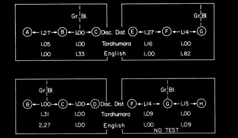
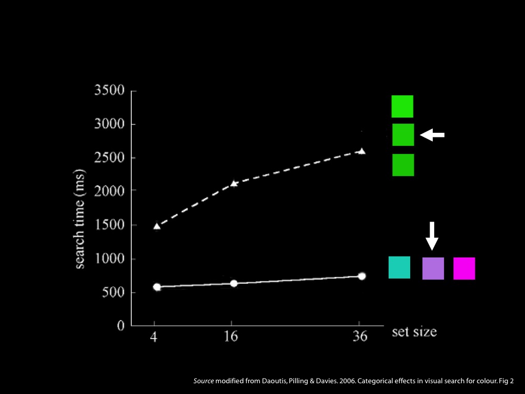
Kay & Kempton 1984, figure 3

In brief: Kay and Kempton contrasted the responses of native English speakers (who have words for green and blue) with native Tarahumara (a Uto-Aztecan language of northern Mexico) speakers, whose basic colour words mark no such distinction.
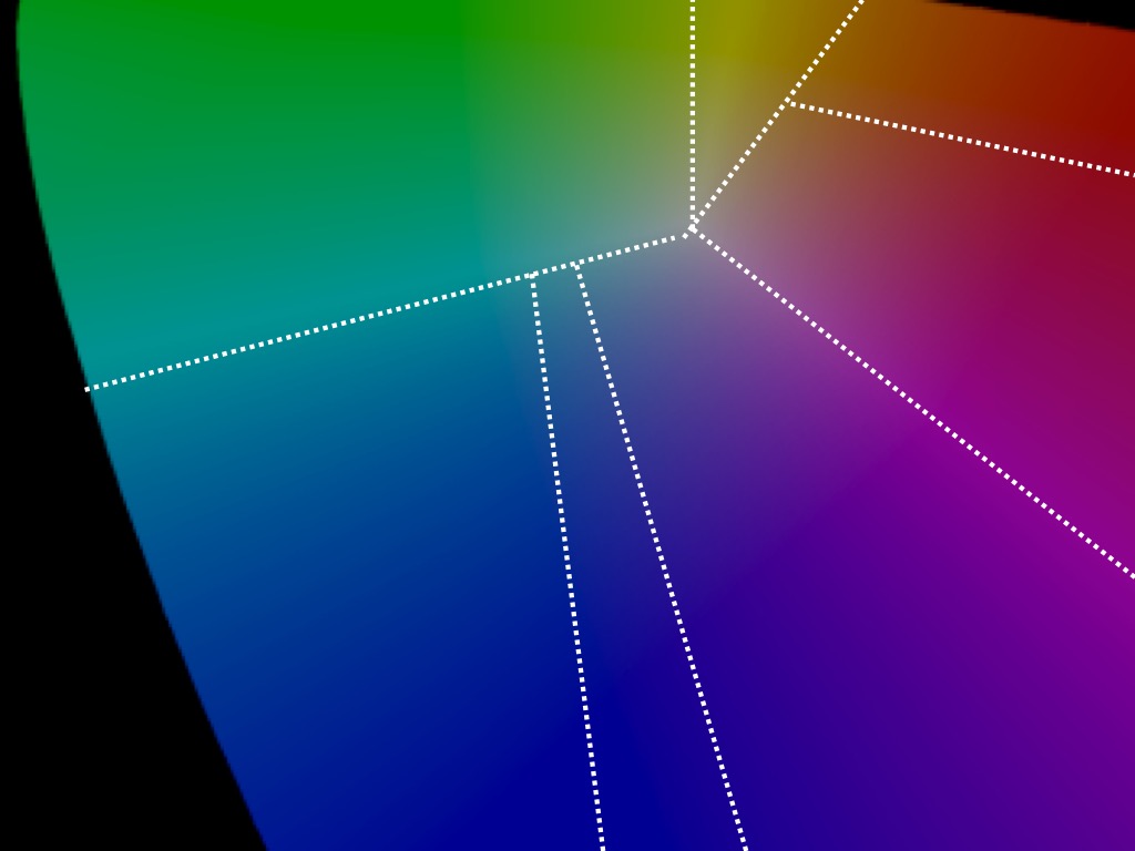
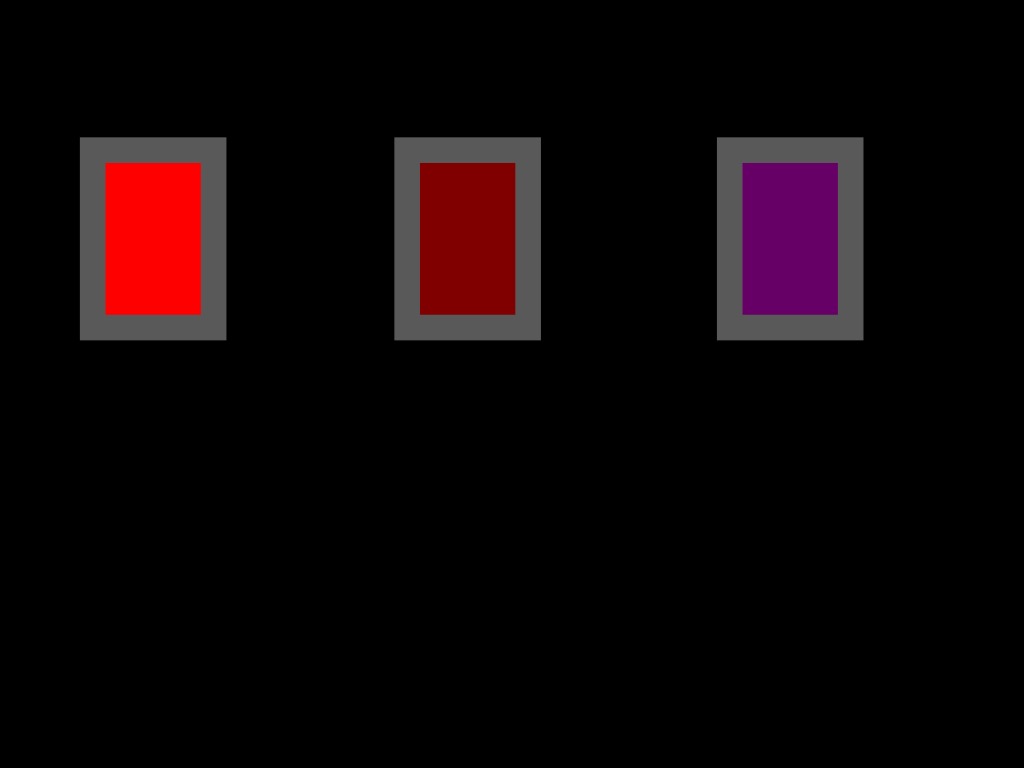
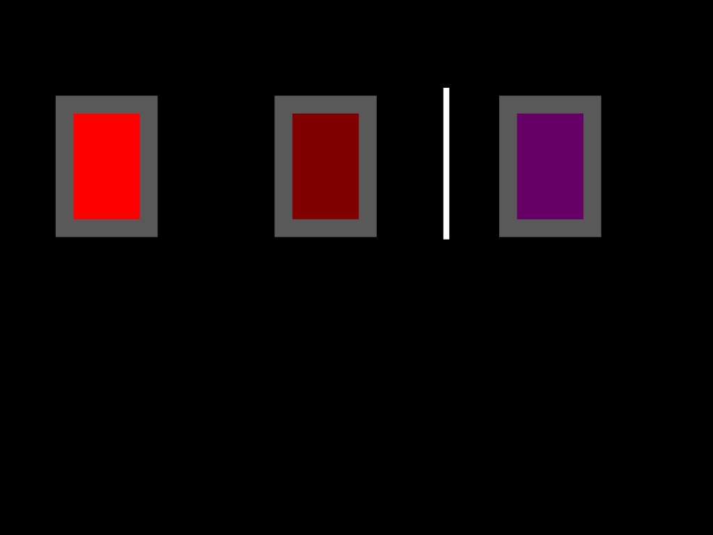
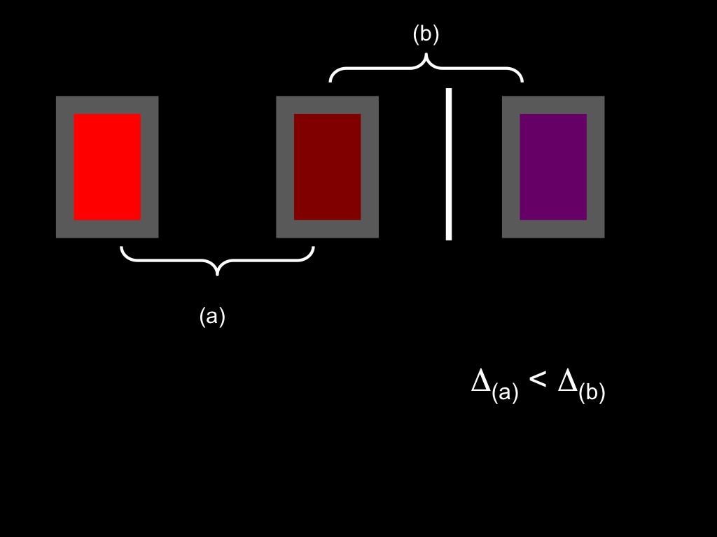
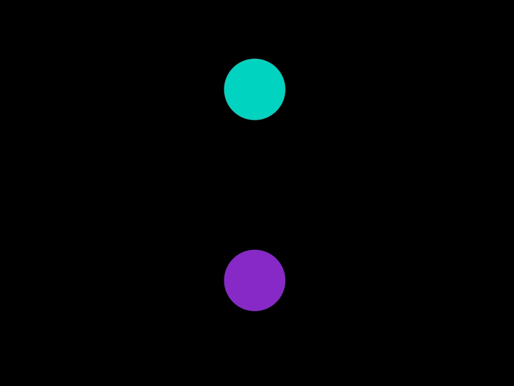
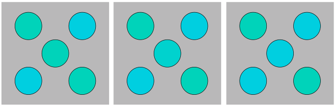
Here you see a triad of colours, A, B and C. Kay and Kempton first measured ‘discrimination distance’. That is, how far apart are each of these in terms of JNDs? As it turns out, JNDs are not affected by which categorical colour properties you can name \citep{witzel:2013_categorical}. So we would expect discrimination distance to be approximately the same for all participants. (Some studies do measure discrimination distance for each subject individually and find indiviudal differences; e.g. \citep{witzel:2014_categorical}). In this case, you can see that A is further from B in JNDs than B is from C.
‘discrimination distance’: ‘The scale of psychological distance between colors we take as the "real" scale for present purposes is called discrimination distance. The unit of this scale is the just noticeable difference (jnd), that is, the smallest physical difference in wavelength that can be detected by the human eye.’ \citep[p.~68]{kay_what_1984}
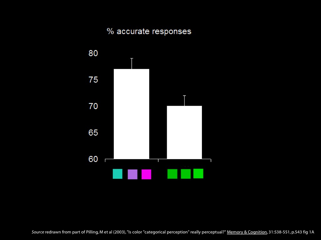
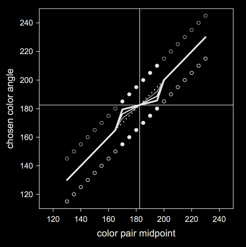
Next Kay and Kempton measured how visually similar their subjects judged these samples to be. To do this, they showed them different triads of colours and asked them, Which is the most different from the other two? For each pair they then computed the proportion of times that pair was split. (As they write: ‘The psychological distance between A and B relative to other stimulus pairs in the set is given by the proportion of times A and B are split by the subject's selection of one of them as the most different item in the triad.’ p. 70.) This is what you see from the Tarahumara speakers and the English speakers under the circles.
Looking at the numbers, you can see that the English speakers tended to split B and C more often than A and B, whereas the Tarahumara speakers did the opposite.
And note that the B-C pair crosses the blue-green boundary. What does this mean? ‘The presence of the blue-green lexical category boundary appears to cause speakers of English to exaggerate the subjective distances of colors close to this boundary. Tarahumara, which does not lexicalize the blue-green contrast, does not show this distorting effect.’
\citep[p.~77]{kay_what_1984}: ‘the English speaker judges chip B to be more similar to A than to C because the blue-green boundary passes between B and C, even though B is perceptually closer to C than to A.’
This is exactly the sort of evidence that should persuade us that red things differ in visual appearance from non-red things.
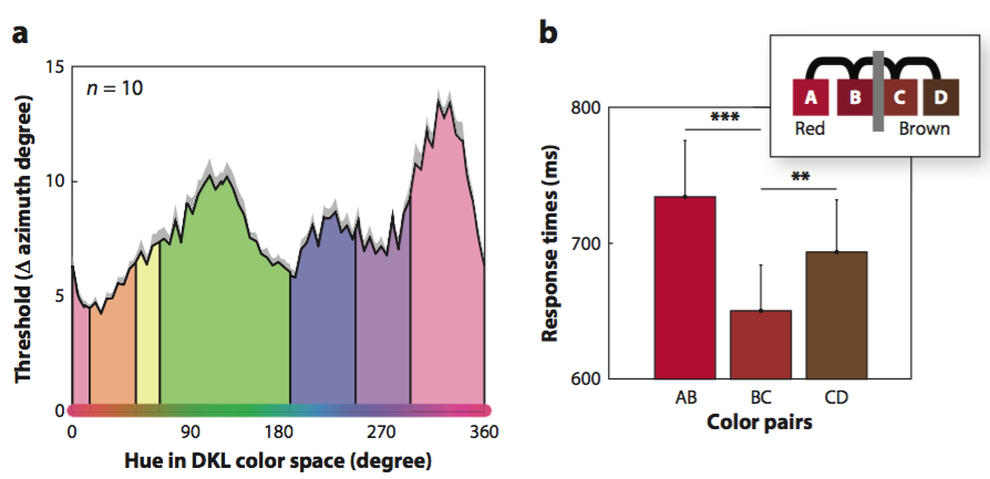
Here’s another comparison. In this case, the discrimination distance (in JNDs) was the same between the three colour samples. Both groups thought that B and C are most different, and these cross the blue-green boundary. But this effect was stronger in the English speakers.
There were some other comparisons that I won’t talk about.
Overall, this is evidence for the conclusion that red things differ in visual appearance from non-red things.

Is the effect due to

visual appearances

or merely to

the ‘Name Strategy’?

The ‘name strategy’: ‘We propose that faced with this situation the English-speaking subject reasons unconsciously as follows: “It's hard to decide here which one looks the most different. Are there any other kinds of clues I might use? Aha! A and B are both CALLED green while C is CALLED blue. That solves my problem; I'll pick C as most different.” ... this cognitive strategy ... we will call the “name strategy”’ \citep[p.~72]{kay_what_1984}.
‘According to the name strategy hypothesis, the speaker who is confronted with a difficult task of classificatory judgment may use the lexical classification of the judged objects as if it were correlated with the required dimension of judgment even when it is not, so long as the structure of the task does not block this possibility’ (p. 75).

Kay & Kempton (1984, Experiment 2)

They consider a modification to block use of the naming strategy. This involves showing subjects only two of the three stimuli at any one time (Experiment 2).
(‘The three chips were arranged in a container with a sliding top that permitted the subject to see alternately either of two pairs of the three chips, but never all three at once. For example, in triad (A, B, C) the pairs alternately made visible were (A, B) and (B, C).’) When they do this, categorical colour properties have no effects on perceptual judgements of similarlity. ‘Subjective similarity judgments follow discrimination distance and reflect no influence from lexical category boundaries’ (p. 73).

Kay & Kempton 1984, figure 4

Here are the results from experiment 2. In this case, there are only English speaking subjects. And the numbers for the subjects are ‘simply the number out of 21 subjects who chose the indicated pairwise subjective distance as larger.’
The results now are quite different. Top left: subjects appear to go with discriminability (JND distance) rather than colour category. Bottom left: when discriminability (JND distance) is equated, subjects show no significant effect of colour category (although there is a trend).
‘Subjective similarity judgments follow discrimination distance and reflect no influence from lexical category boundaries.’ \citep[p.~73]{kay_what_1984}

conclusion: red things do not differ in visual appearance from non-red things

Conclusion: the name strategy explains the effects of Experiment 1. Red things do not differ in visual appearance from non-red things

objection:

‘I’d like you to tell me which is bigger: the difference in greeness between the two chips on the left or the difference in blueness between the two chips on the right.’

They changed the instructions between Experiment 1 and Experiment 2.
This change invites the objection that the instruction encouraged subjects to attend to hue and ignore other features of the colour. So the results are inconclusive.
Why spend so long on flawed research from which we can’t draw a conclusion either way? To illustrate that the issue is quite complex, and that you have to read papers carefully! (You aren’t supposed to discuss minutae of papers in your essays; you’re not an expert on stats or methods. But if you cite a paper in support of a claim, you’d better be as sure as you can that the paper really does support that claim.)

Witzel & Gegenfurtner (2014)

++ discrimination and category boundary measurements for individual subjects

++ more categories tested (‘Rosa’, ‘Braun’, ‘Orange’, ‘Gelb’, ‘Gruen’, ‘Blau’, and ‘Lila’)

According to more recent research discussed in \citep{witzel2014category} (a published report is not yet available), in fact they do not. That is, whether things are \emph{red} appears to make no difference to judgements of similarity (\citealp{witzel2014category}; actually these researchers did not test ‘red’, but they did test the German terms ‘Rosa’, ‘Braun’, ‘Orange’, ‘Gelb’, ‘Gruen’, ‘Blau’, and ‘Lila’.) This indicates that things which are \emph{red} do not thereby differ in visual appearance from things that are not \emph{red}.

++ prototype effects found, but ‘there were literally no effects at boundaries’ (p.c.).

From correspondence: ‘that experiment was originally reported in the same paper as the "Categorical facilitation" one, but it was too long. Up to now it is only in my thesis and there is the abstract, which I paste you below. Note, however, that we found slight traces of perceptual magnet effects around prototypes when reanalysing the data later on, which is reflected in the book chapter, but not the older abstract. The found effects are quite systematic (happening at almost all prototypes), but also extremely weak, and there were literally no effects at boundaries.’
How can we defend the view that red things differ in visual appearance from non-red things? Maybe there are differences in visual appearance that we are not aware of? Maybe the judgements of similarlity are not sensitive enough? (But note that \citet{witzel2014category} did find evidence for the effect of prototypes on judgements of similarity, so the method seems good: to test this, the three colour samples were arranged so that the prototype was positioned between a middle and an outer sample. ‘Colours close to the prototypes were judged to be more similar than they actually were in terms of pure discrimination’.)
\begin{center} \includegraphics[scale=0.25]{img/categorical_colour_difference3.jpg} \end{center}

Hypothesis: Red things differ in visual appearance from non-red things.

Predictions:

1. Redness will influence discrimination.

2. Redness will influence similarity judgements.

3. Redness will influence pop-out effects.

4. Redness will influence perceptual grouping.

‘Category effects on color perception. (a) Categorical sensitivity. The diagram shows how the sensitivity to color differences changes across hue. The x-axis corresponds to hue in DKL color space, and the y-axis to discrimination thresholds. Adapted from Witzel & Gegenfurtner (2013). Note that the green-blue boundary is unlike the others in that it coincides with a local minimum of discrimination thresholds. (b) Categorical facilitation. The bars along the x-axis of the main graphic correspond to color pairs that are composed of the colors illustrated by the inset. The y-axis of the main graphic represents response times in speeded discrimination. Note that discriminating the color pair BC, in which B and C belong to different categories (i.e., red and brown), is fastest even though the distances between colors control for sensitivity to color differences. Adapted from Witzel & Gegenfurtner (2016). Abbreviation: DKL, Derrington-Krausfopf- Lennie. ∗∗p < 0.01; ∗∗∗p < 0.001.’
Another measure on which the green sequence differs from the blue-pink-purple sequence is pop-out, which is defined operationally in terms of visual search tasks \citep[p.\ 117]{Treisman:1986pm}. First I need to explain what a visual search task is. In visual search tasks tasks, subjects are shown an array of objects and asked to identify the one with a certain property. For example, one might be shown an array of twenty animal pictures and asked to identify the cat. Normally the time it takes subjects to find a target increases linearly as the number of objects in the array increases. But when the target of a visual search is defined in terms of colour and the colours of the distractors are categorically different from the colour of the target, subjects can find the target just as quickly when it is in among 36 distractors as when there are only four distractors \citep[Experiment 1]{Daoutis:2006qk}. This is, the colours pop out.
\textbf{pop-out} ‘Such targets pop out of the display, so that the time it takes to find them is independent of the number of distractors’ \citep[p.\ 117]{Treisman:1986pm}.
When target and distractors differ in colour category there can be pop-out effects \citep{Daoutis:2006qk}.

visual search task

\begin{center} \includegraphics[scale=0.25]{img/categorical_colour_difference3.jpg} \end{center}

Hypothesis: Red things differ in visual appearance from non-red things.

Predictions:

1. Redness will influence discrimination.

2. Redness will influence similarity judgements.

3. Redness will influence pop-out effects.

4. Redness will influence perceptual grouping.

‘Category effects on color perception. (a) Categorical sensitivity. The diagram shows how the sensitivity to color differences changes across hue. The x-axis corresponds to hue in DKL color space, and the y-axis to discrimination thresholds. Adapted from Witzel & Gegenfurtner (2013). Note that the green-blue boundary is unlike the others in that it coincides with a local minimum of discrimination thresholds. (b) Categorical facilitation. The bars along the x-axis of the main graphic correspond to color pairs that are composed of the colors illustrated by the inset. The y-axis of the main graphic represents response times in speeded discrimination. Note that discriminating the color pair BC, in which B and C belong to different categories (i.e., red and brown), is fastest even though the distances between colors control for sensitivity to color differences. Adapted from Witzel & Gegenfurtner (2016). Abbreviation: DKL, Derrington-Krausfopf- Lennie. ∗∗p < 0.01; ∗∗∗p < 0.001.’

Webster & Kay 2012, figure 1

Converging evidence that things labelled with different basic colour terms do not thereby differ in visual appearance involves a third method for detecting visual appearances (\citealp{webster:2012_color}). The idea, as illustrated in Figure \vref{fig:perceptual_grouping}, is that how things appear with respect to colour should influence how likely it is that they will be grouped together perceptually. The results are consistent with the view that whether objects are labelled with the same basic colour term makes no measurable difference to how they are grouped perceptually. This further supports suspicion that properties denoted by colour terms like ‘red’ make no difference to visual appearances (see also \citealp{davidoff:2012_perceptual}).
Let’s consider the experiment in more detail. ‘circles at opposite diagonal corners of the square had the same color, while the two diagonals differed in color by a fixed angle of 30°’.
The center circle could either be the same colour as one of the diagonals (as in the left and right panels), or it could be an inbetween colour (as in the middle panel). When the central colour is the same as one of the diagonals, you should perceptually group the diagonal as a line, like \/ or \\.
Subjects’ task was indeed to judge which way the diagonal went. \citet{webster:2012_color} varied the center colour to find at what point a given subject was equally like to judge that the line was \/ or \\. Call this the ‘grouping midpoint colour’. (p. 378: ‘Observers made a two-alternative forced choice response to indicate whether the perceived orientation was clockwise or counterclockwise. A staircase varied the center color angle to estimate the an- gle at which both orientations appeared equally likely, with the point of subjective equality estimated from the mean of the final 10 of 13 reversals in the staircase.’)

Webster & Kay 2002, figure 2

\citet{webster:2012_color} reasoned like this: \begin{enumerate} \item Where the two diagonals are from within the same colour category, the grouping midpoint colour should be the midpoint in a colour space that represents retinal colour discrimination. \item Where the two diagonals are from different colour categories (one is green, the other is blue), and one of the diagonals is just over a boundary, then the grouping midpoint colour should be closer to the colour of the diagonal that is just over the boundary in a colour space that represents retinal colour discrimination. \end{enumerate}
This prediction is illustrated in the figure. The dotted line shows the prediction if there is no effect of colour category on perceptual grouping; the solid lines show different strengths of effect.
They found that almost no indicators of an effect of colour category on perceptual grouping (there are a variety of measures and one was signifiant: p. 381: ‘the participants’ settings thus trended toward a (very weak) CP effect, with an average bias of 0.10 (which was nevertheless significantly differ- ent from zero; t (7) = 3.73, p < .01).’). They also suggested that these effects may be due to the use of CIELAB as a colour space (p. 382: ‘ the small biases we found in the observer’s settings may in part include an artifact of the stimulus space, weakening further the evidence for a clear CP effect in the grouping task.’)
\begin{center} \includegraphics[scale=0.25]{img/categorical_colour_difference3.jpg} \end{center}

Hypothesis: Red things differ in visual appearance from non-red things.

Predictions:

1. Redness will influence discrimination.

2. Redness will influence similarity judgements.

3. Redness will influence pop-out effects.

4. Redness will influence perceptual grouping.

‘Category effects on color perception. (a) Categorical sensitivity. The diagram shows how the sensitivity to color differences changes across hue. The x-axis corresponds to hue in DKL color space, and the y-axis to discrimination thresholds. Adapted from Witzel & Gegenfurtner (2013). Note that the green-blue boundary is unlike the others in that it coincides with a local minimum of discrimination thresholds. (b) Categorical facilitation. The bars along the x-axis of the main graphic correspond to color pairs that are composed of the colors illustrated by the inset. The y-axis of the main graphic represents response times in speeded discrimination. Note that discriminating the color pair BC, in which B and C belong to different categories (i.e., red and brown), is fastest even though the distances between colors control for sensitivity to color differences. Adapted from Witzel & Gegenfurtner (2016). Abbreviation: DKL, Derrington-Krausfopf- Lennie. ∗∗p < 0.01; ∗∗∗p < 0.001.’

Do red things differ in visual appearance from non-red things?

So do red things differ in visual appearance from non-red things?

As far as we know: No!

While doubts might be raised about the details of one or another method, the overall pattern is clear: the most careful attempts to find differences in appearance associated with properties denoted by colour terms like ‘red’ have all failed.
To reject this conclusion, we would have to insist that differences in appearance exist but influence neither judgements of perceptual similarity nor perceptual grouping and so are too subtle to detect. This is certainly possible, but it seems wrong simply to insist that it is correct.
Whether colour terms like ‘red’ denote properties of objects that are presented in visual experience is something best decided experimentally, not introspectively; and, as far as we know, they do not.